

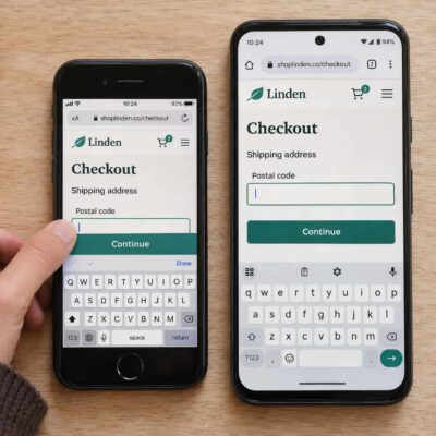
A page can fit neatly in a desktop browser’s mobile preview and still fail on a phone. A sticky button might cover a form field when the keyboard opens, or a menu might rely on hovering to reveal its links. When you evaluate a Smartphone with CompareCelular (smartphone com o CompareCelular), consider how its screen size and browser can help you catch layout and touch issues before launch. Start with a small set of devices, then run the same tasks on each to see where the experience breaks.
Compare Viewport Widths and Screen Heights
A phone’s advertised screen size is measured diagonally. Responsive layouts use the browser viewport, measured in CSS pixels. Two phones with the same screen diagonal can give a page different amounts of usable space. Check that your pages use a viewport meta tag with width=device-width and initial-scale=1, then resize your preview through widths such as 320, 360, 390, and 430 CSS pixels. Treat these as test widths. Pay particular attention just before and after a breakpoint, where a navigation label, product card, or table may no longer fit.
Test both short and tall screens in portrait and landscape. Open an article with a long headline, a product page with several options, and a form with an error message. Look for sideways scrolling, clipped labels, and buttons that disappear below a fixed banner. Scroll until the browser toolbar retracts, then reverse direction. If a menu or modal is designed to fill the screen, check that its close button stays reachable in both states. Large viewport units such as 100vh can size content beyond the visible area when browser controls are showing.
Test Safari and Chrome on Real Phones
Use Safari on an iPhone and Chrome on an Android phone as your starting pair. Run the same actions in both browsers, including opening navigation, submitting a form, and returning to a listing with the back button. Watch for changes in scroll position, the placement of fixed elements, and how date or file inputs open. If your analytics show meaningful traffic from Samsung Internet or from links opened inside social apps, repeat your most important flows in those browsers too.
Chrome DevTools’ device mode is useful for checking many widths and finding where a layout breaks. Confirm the result on a physical phone to see how the actual browser, keyboard, and touch input behave together. You can inspect Chrome on a connected Android device with desktop DevTools. For iPhone Safari, use Web Inspector from a connected Mac. Record the phone model, operating system, and browser version with each bug report so someone else can reproduce it.
Check Touch Interactions and Forms
Hold the phone the way a visitor would. Open the menu with your thumb, dismiss a banner, choose an item from a dropdown, and tap two neighboring controls in succession. Small icons can look fine in a screenshot while being easy to miss in use. WCAG 2.2 sets a minimum pointer target size of 24 by 24 CSS pixels, with exceptions such as adequate spacing. Give frequently used controls extra room where the layout allows it.
Try scrolling past a carousel to see if it captures a vertical swipe. Check that a tap can reveal information that appears on hover on desktop. For forms, focus the last field, type with the keyboard open, and trigger a validation error. Make sure the field, its error message, and the next action remain reachable. If the site has a sticky checkout bar or chat button, check whether it overlaps the keyboard or the control the visitor needs.
Choose Devices That Catch Different Problems
| Smartphone | What to test first |
|
iPhone SE (3rd generation)
|
Use its compact 4.7-inch screen to test crowded headers, short modals, and forms with the keyboard open. |
|
iPhone 16 Plus
|
Use its 6.7-inch screen to check sticky controls, bottom sheets, and whether common actions are within thumb reach. |
|
Google Pixel 9a
|
Use its 6.3-inch screen to test Chrome on Android, particularly navigation, forms, and viewport changes as browser controls appear. |
|
Samsung Galaxy A16 5G
|
Add a second Android model with a 6.7-inch screen. Try image-heavy pages and test Samsung Internet if your visitors use it. |
If you can test on only two phones, start with a compact iPhone and an Android model your audience uses. Add a larger phone if the site relies on bottom navigation or sticky actions. Use device and browser data from your current site, if available, to decide which models to test next.
Run the Same Tasks Before Launch
Use a staging build with realistic content. Include a long product name, a tall image, and a paragraph with several links. Placeholder text can hide wrapping problems that appear only when an editor publishes a real page. Try larger text and pinch-zoom on both platforms. Check that visitors can still read the content, dismiss overlays, and reach the primary action when text takes up more space.
Test the pages visitors enter from search, ads, or shared links. On each phone, open a landing page, navigate to a detail page, and complete the primary action, such as submitting a form or adding an item to the cart. Fix anything that blocks the task, then rerun the same steps on the affected phones. A successful retest means a visitor can finish the task from start to finish on the devices you’ve chosen.